Restaurant website templates are useful when they accelerate the right decisions. They are harmful when every venue is squeezed into the same full-screen food photograph, scripted flourish and hard-to-find menu. A guest usually wants something simpler: what kind of place is this, where is it, can I afford it and can I book?
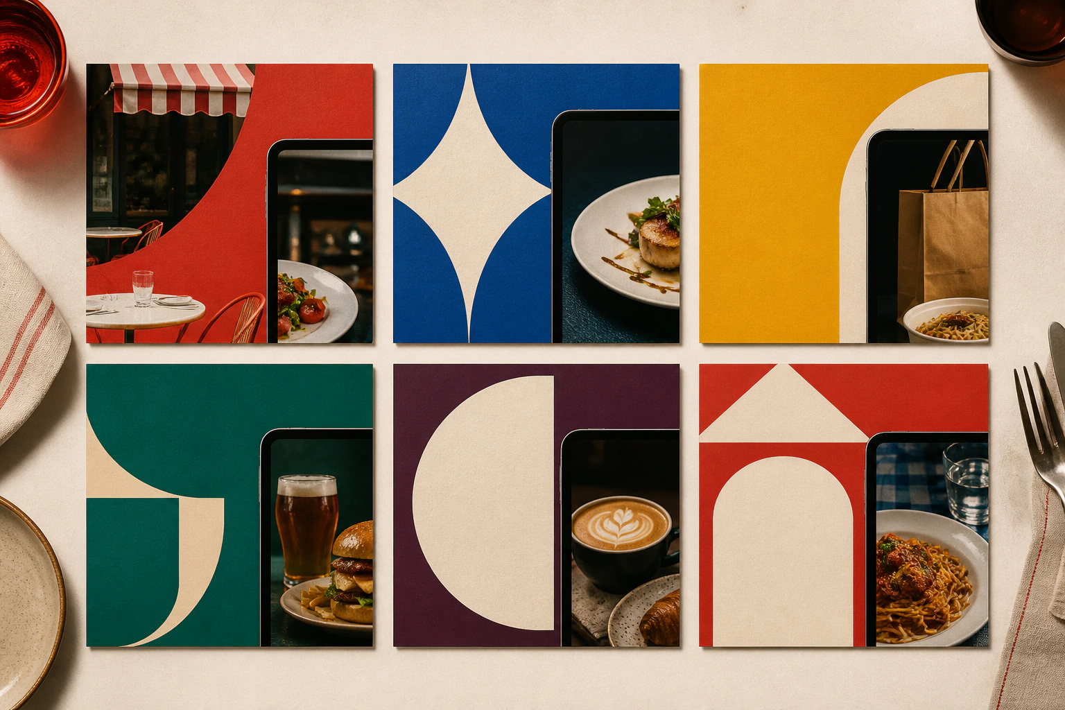
The six directions below are original Elkwood planning concepts, not downloadable themes or copies of existing restaurants. Use them to brief a site around real content. The right choice depends on the meal, audience and booking model, not the latest visual trend.
Related guidance: For useful context, read 15 Best Electrician Websites and What Makes Them Work and 15 Plumbing Website Examples That Make Enquiring Easy.
What every restaurant template should include
Before choosing a style, confirm that the layout can support:
an HTML menu that works without downloading a PDF;
address, opening times and contact details;
dietary and accessibility information;
a clear reservation or walk-in explanation;
real, properly licensed food and venue photography;
private-event or group-booking information where relevant;
a fast mobile experience.
Direction | Best suited to | Primary action |
|---|---|---|
Neighbourhood bistro | Independent local restaurant | Book a table |
Destination dining | Venue-led special occasion | Explore and reserve |
Fast casual | Counter service and takeaway | View menu or order |
Pub and kitchen | Food, drink and events | Book or find us |
Tasting menu | Fixed or seasonal experience | Check menu and availability |
Multi-location group | Shared brand across venues | Choose a location |
1. The neighbourhood bistro
This direction should feel personal and easy rather than theatrical. Open with the food, atmosphere and location in one short message. Follow with today's practical choices: menus, opening times and booking.
Suggested page structure
Short proposition, current food image and booking button.
Menu highlights with a link to the full HTML menu.
A concise account of the kitchen and neighbourhood.
Hours, address, map and accessibility notes.
Reviews or press with clear sources.
Use warm photography but avoid making the first screen so tall that the guest cannot see whether the restaurant is open. A mobile booking control can remain within reach without covering the content.
2. The destination dining concept
A hotel restaurant, countryside venue or architecturally distinctive dining room can give place more room in the story. The design may use larger images and a slower editorial rhythm, but practical information still needs to remain obvious.
What earns the extra space
Show the arrival, room and surroundings as well as plated dishes. Explain travel, parking, dress expectations and accessibility. If a stay, spa or event is part of the wider destination, connect it without confusing the restaurant booking route.
Do not hide prices behind atmosphere. A special-occasion guest may be happy to spend more, but still needs to understand the menu and deposit terms before reserving.
3. The fast-casual service layout
This direction is for restaurants where speed, choice and location matter more than a long origin story. The first screen should clarify the food, fulfilment options and nearest location.
Keep the journey short
Use clear links for eat in, collect or delivery only when each is genuinely available. If ordering moves to a third-party platform, say so and make the handover obvious. Keep allergens and menu information accessible outside the order flow.
Food categories work better than an endless photographed menu. Compress images carefully and reserve motion for moments where it aids understanding.
4. The pub and kitchen structure
A pub site may need to serve drinkers, diners, families, event organisers and people checking whether a match is being shown. The template needs a practical information hierarchy rather than one generic hospitality page.
Group information by visit
Give food, drink, what's on and private hire distinct routes. Keep opening and kitchen times separate where they differ. Include garden, dog, child, parking and accessibility details when they affect the decision.
Event listings need dates that expire automatically. A Christmas menu from two years ago makes an otherwise active pub look neglected.
5. The tasting-menu presentation
For a fixed-menu or chef-led restaurant, the website can focus on the experience without becoming cryptic. State the current menu format, indicative duration, price and dietary policy before the reservation button.
Let the content change seasonally
Use a controlled area for the current menu, producer stories and selected journal pieces. Archive or redirect expired menu URLs deliberately rather than leaving search visitors on an obsolete offer.
Typography and negative space can signal confidence, but legibility comes first. Pale grey text and tiny uppercase labels should not become the price of looking refined.
6. The multi-location restaurant group
A restaurant group needs a brand overview and genuinely useful venue pages. The first decision is often location, so search and navigation should not make the visitor learn the company structure first.
Give every venue one reliable source of truth
Each location should have its own address, opening times, menu context, accessibility details, booking link and approved imagery. Shared brand content can be reused, but practical data should not be copied manually across several pages.
If menus or prices differ, label them. A global “Book now” button that forgets the chosen venue creates avoidable uncertainty.
How to choose between these design ideas
Ask five questions:
What decision brings most guests to the site?
Does the experience depend mainly on food, place, speed or occasion?
Which information changes every week or season?
Who will keep menus, hours and events accurate?
Does booking happen on the site or through another service?
The answers define the content system. Colour and typography should support the restaurant's real identity after the structure works.
Template mistakes to avoid
Do not use an image slider that delays the first useful information. Avoid PDF-only menus, autoplay video with sound, unexplained booking handovers and social feeds that replace maintained website content. Never publish stock dishes that customers cannot order.
Check the layout with a long dish name, an allergen note, enlarged text and a weak mobile connection. A template that only works with ideal sample content is not ready for a working restaurant.
Want the website handled for you?
Elkwood builds managed websites for small businesses across the industries we support. We can adapt one of these directions to a restaurant's real menu, booking process and visual identity, with design, copy, hosting and reasonable updates included from £25 a month.
See what the service includes and the pricing page before deciding whether it fits.
Quick answers
Frequently asked questions
What is the best restaurant website template?
The best template matches the restaurant's main customer decision and can keep menus, times and booking details current. A visually impressive theme is a poor choice if those basics are awkward to update.
Should a restaurant menu be a PDF?
Provide an accessible HTML menu as the primary version. A printable PDF can be optional, but it is often harder to read on a phone and easier to leave out of date.
Does a restaurant website need online booking?
Not every restaurant needs booking, but the policy should be clear. If a third party service handles reservations, explain the handover and keep the venue, date and terms visible.
How often should a restaurant website be updated?
Update practical details whenever they change. Review the whole site at least seasonally and remove expired menus, events and offers promptly.